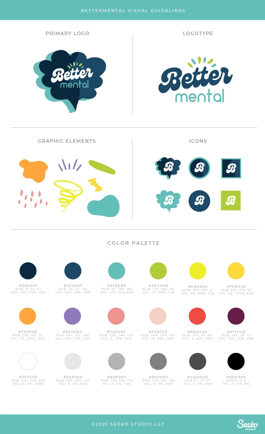
Bettermental podcast branding + photography
CLIENT: Leanna Lee & Mike Veny
ROLE: Creative Director, designer, photographer. Responsible for entire creative execution including location scouting, and all pre-and post photoshoot production.
DELIVERABLES: Logo, branding kit, press photos, website character styles, social media templates (posts, headers, etc.)
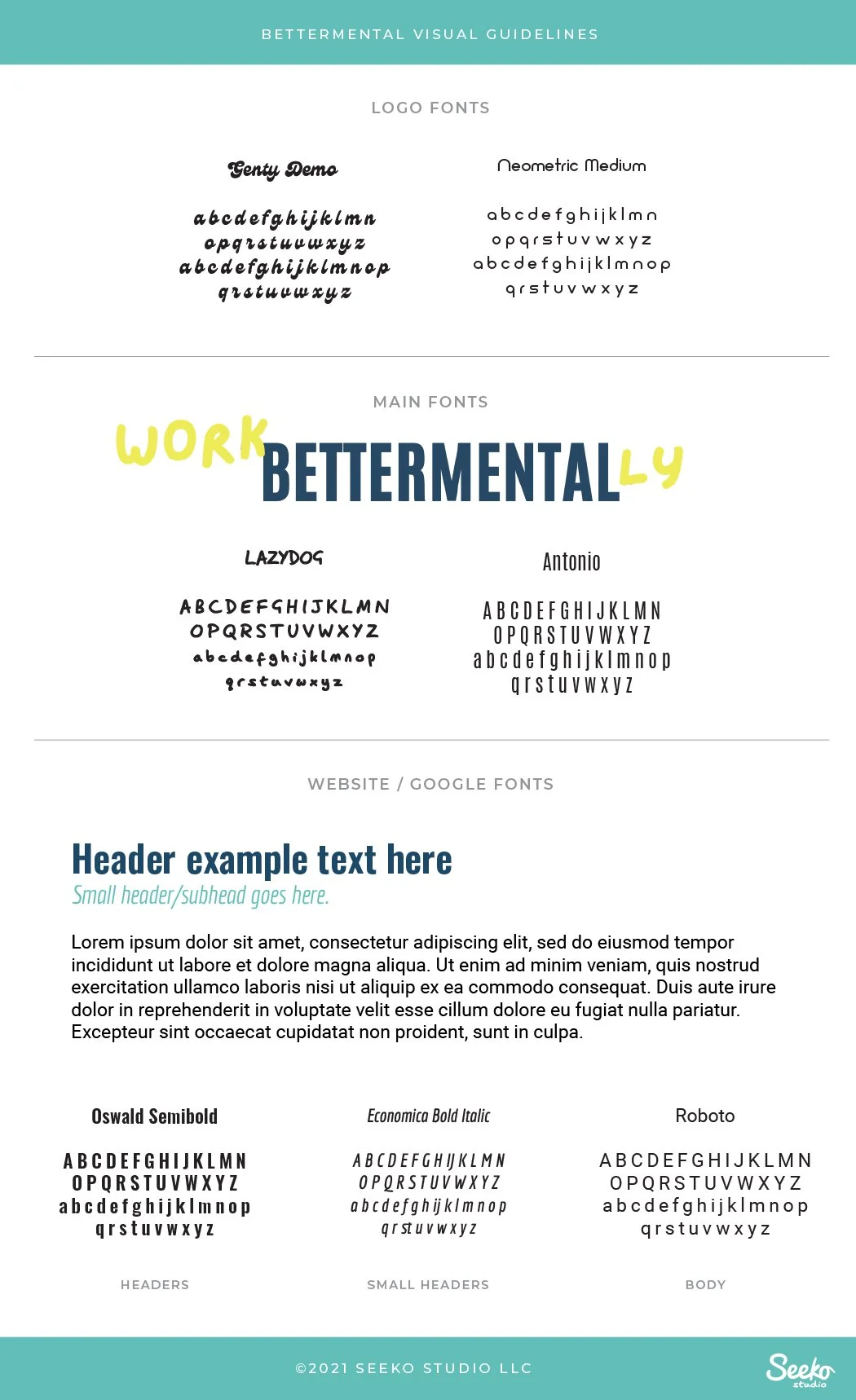
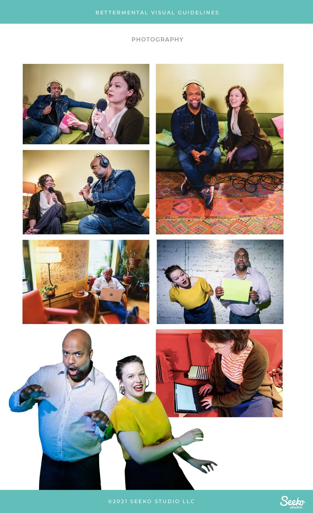
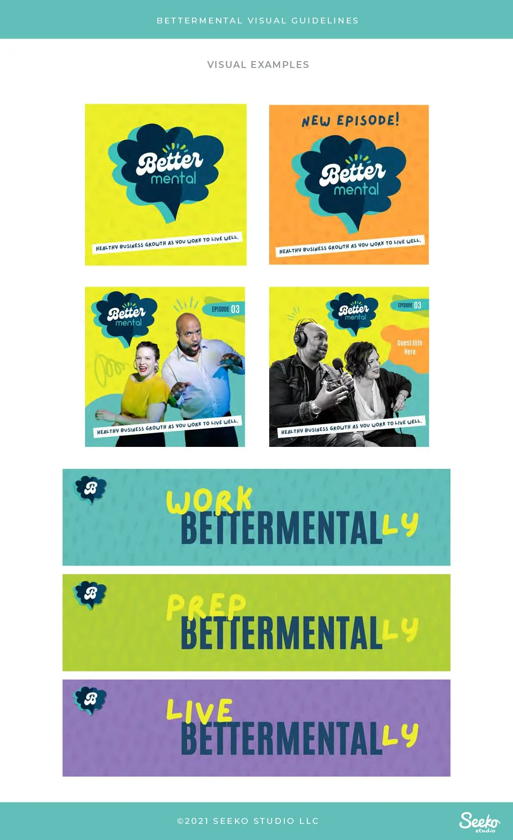
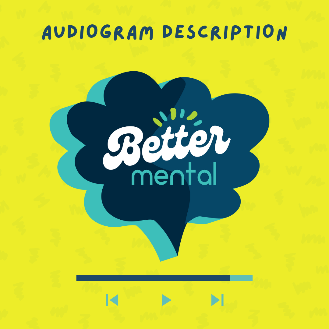
DETAILS: When my client Leanna Lee reached out to see if I was interested in branding her new project, I was all ears. Leanna and her friend Mike were in the early stages of developing a mental health podcast for small business owners. They requested an aesthetic that was playful, colorful, and approachable because they wanted the podcast to come across as conversational and light-hearted. At some point in the ideation process Leanna mentioned the 90s, so I leveraged Saved by the Bell as a major inspiration (go, Bayside!). To my delight, Leanna and Mike liked this visual direction, and really leaned into it during our brand photo session.
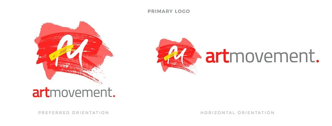
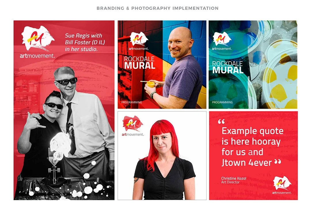
the art movement inc: branding, photography, & creative marketing strategy
501(c)(3) / STARTUP CLIENT: The Art Movement Inc.
ROLE: Creative Marketing Director
USAGE: Web, print, event, social media, apparel, etc.
DETAILS: After graduating from UMASS Amherst with a BA in Arts Management September 2018, I felt compelled to seek out clients and opportunities in the nonprofit sector. When I began researching causes, I was happy to discover that Sue Regis, a friend and fellow artist, was in the process of founding an arts NPO in my hometown Joliet, IL, USA. Contributing to the cultural growth of Joliet was an exciting prospect, so I was thrilled when Sue and the board asked me to join the organization in May 2019.
Since The Art Movement Inc. was a startup organization in its infancy, I was tasked with developing all things creative for the group (branding, messaging, and marketing strategy). Diving into this extensive task was a treat because the board granted me complete creative freedom, which is a rarity! The only feedback I received at the kickoff was that red (my favorite color) was favored for the branding. This was to my liking :)
The organization was granted 501(c)(3) status in September 2019 and continues to ignite passion for the arts in Joliet.
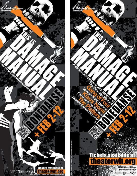
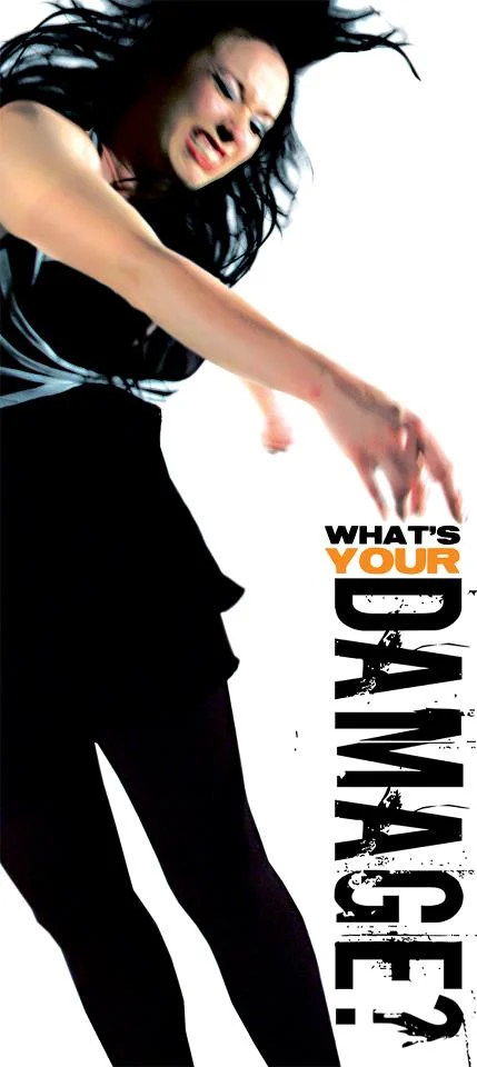
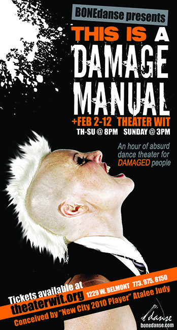
BoneDANSE: This is a Damage Manual branding
501(c)(3) CLIENT: BoneDANSE
ROLE: Co-Art Director, Co-Designer, and Photographer. Owner Atalee Judy and I collaborated as an art director/designer duo on all press materials.
USAGE: Promotional posters, official theatrical poster, mailers, e-blasts, print ads, flyers, web
PRESS: New City, Time Out Chicago, Chicago Reader, Chicago Tribune
DETAILS: Prior to This is a Damage Manual, BONEdanse owner Atalee Judy tackled everything administrative and creative (sans photo and video) for every production since 1997 - a massive task! Looking to lighten her load, she asked me to assist with art direction and design for This is a Damage Manual. The materials Atalee and I created for this press campaign harnessed the "punk rock ferocity" that was present in all Breakbone Dance Company/BONEdanse productions. We used a bold color palette of black, that included "safety" oranges to draw attention to the work and hint at its theme (caution! damage!) and a distressed font to drive the message home.